Credit card statement design
When it comes to layout design, the very essentials can be learned in an afternoon by reading a book like Robin Williams, [[[The Non-Designers Design Book]]]. Of those essentials, one thing we learn is that you don't need to put boxes around and lines under everything on the page. As an example, the book suggests printing an Excel spreadsheet with and without the grid-lines enabled. The difference in readability is striking!
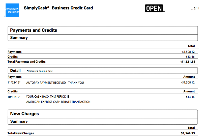
American Express is a 62 billion dollar company. You'd hope a company that size could hire some designers who've at least learned the basics. But judging from the look of their statements, that wouldn't seem to be the case.
Just look how illegible this statement is:

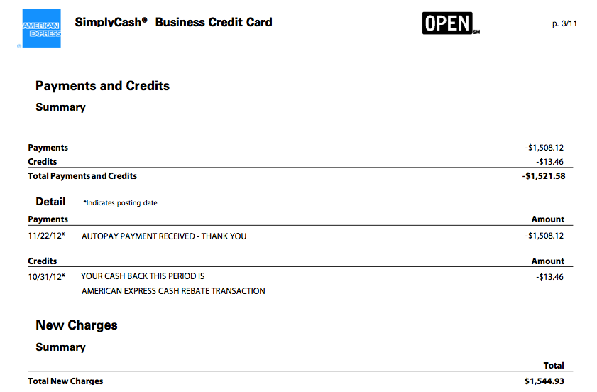
Now consider the same statement, with nothing more changed than simply removing the unnecessary boxes and lines. (Of course, the layout could still be dramatically improved; but just look at the difference made by applying the basic design rules learned in an $8 Kindle book!)

Ok, I'm being a little overly critical of AMEX here. To be honest, they are one of my favorite companies. Great customer service, and their web app is pretty darn nicely designed!
Just wish they designed their statements a little better!
Enjoy this article? — You can find similar content via the category and tag links below.
Categories — Design
Questions or comments? — Feel free to email me using the contact form below, or reach out on Twitter.
