
Poor user experience design at CapitalOne
During the past few years, the financial institution CapitalOne hinted at the importance they give to design, through the acquisition of design companies Adaptive Path in 2014 and Monsoon in 2015.
My guess is that they've been focusing their efforts on the recently-released CapitalOne mobile app, which I have to say reflects some wonderful design work.
My hope is that in the future, they'll turn their attention to the website, which still suffers some usability problems like the following.
Curious whether my credit card auto-pay is properly configured, I visited the CapitalOne.com website today, and clicked on "Manage Auto-Pay". Here's where that led:
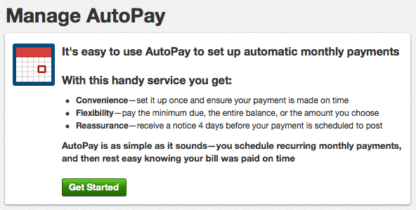
I was almost certain that I already had auto-pay setup, but it looks like I don't. In that case, let's click "Get Started" to set it up...

The red alert—cognitively communicating that I did something wrong and, furthermore, am attempting to do something disallowed (adding more than one AutoPay to an account)—reveals that in fact I did already have auto-pay setup, and so all my confusion and frustration was unnecessary.
Enjoy this article? — You can find similar content via the category and tag links below.
Categories — Rants
Tags — User-Experience
Questions or comments? — Feel free to email me using the contact form below, or reach out on Twitter.